UX Designer, Graphic Designer, User Researcher
Grad Flow
Role:
User Researcher, UX Designer
GradFlow is an accessibility-first study system designed to help graduate students manage academic workload, focus, and well-being within a single integrated platform. Through user research, personas, and iterative prototyping, we developed a Plan → Focus → Reflect workflow that combines scheduling, focus sessions, progress tracking, and mental-health reflection tools to reduce cognitive overload and improve productivity. Usability testing with graduate students showed strong usability and positive feedback, indicating the system effectively supports both academic organization and personal well-being.


The diagram illustrates the stakeholder ecosystem surrounding the graduate student experience and the audiences considered during the design process. At the center are the direct users—graduate students, including neurodivergent and international students—whose academic workload, accessibility needs, and well-being challenges informed the project’s design focus. Surrounding them are supportive advocates, such as professors, academic advisors, peer study groups, and campus support services, who play an important role in helping students succeed. Additional groups, including university administrators, IT services, and technology vendors, influence implementation and adoption, while extreme users with accessibility needs highlight the importance of inclusive design and equitable access. The diagram also acknowledges potential skeptics, such as faculty concerned about AI integration, emphasizing the broader institutional considerations involved in introducing new academic support tools.
This chart displays a sentiment analysis heatmap summarizing themes identified from graduate student interviews. The analysis shows the most positive sentiment around learning strategies (+0.40) and time & scheduling (+0.35), indicating strong interest in tools that support adaptive study techniques and organization. In contrast, focus & attention (−0.15) and mental health & coping (−0.05) showed more negative sentiment, highlighting distraction, fatigue, and burnout as key challenges that informed the design direction of the GradFlow system.


The journey map above visualizes the graduate student workflow across five stages—Plan, Study, Balance, Use Tools, and Reflect—highlighting key activities, user sentiments, and emerging themes from interview data. The emotional trend line reveals how students often experience frustration during focus-intensive study periods and tool fragmentation, but regain motivation when reflecting on progress and purpose. These insights informed design opportunities for GradFlow, including AI-supported scheduling, distraction-free focus sessions, integrated productivity tools, and reflection features that reinforce motivation and well-being.
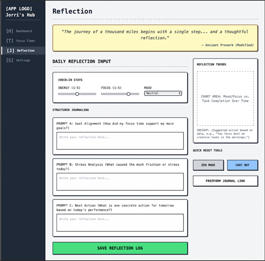
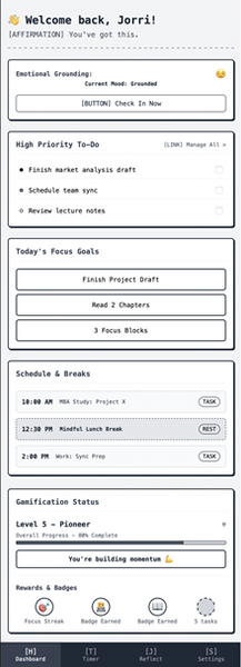
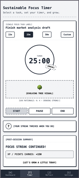
Wireframes


Quantitative Findings

Version A - Focus Flow
Mean SEQ: 6.33
-
Slightly more difficult due to structured productivity steps
-
Participant scores: 6, 7, 6
Version B - Mental Health Flow
Mean SEQ: 6.67
-
Tasks felt more intuitive and emotion-based
-
Participants scores: 7,6,7
Interpretation:
-
All scores ranged from 6-7, showing strong ease of use
-
Not outliers across participants
-
Version B shows a small but meaningful ease-of-used advantage

Final Score: 66.7%
EXCELLENT
-
On a range from -100 to 100, GradFlow scored a 66.7%, suggesting that the majority of participants are highly likely to recommend GradFlow to other users.
-
With 33% participants feeling satisfied, but not enthusiastic, there’s still room for improvement.
-
Overall, there were no significant negative reactions to GradFlow

Overall
●Participants expressed a generally positive attitude towards the prototype with a range of 3.31–3.51, with only occasional points of confusion,
●Confusion points were centered around labels, navigation, or how specific features were organized
Key Findings (A/B Testing)
●Participants who used the focus-oriented dashboard (P2, P4, P6) talked more about getting through tasks and whether the steps made sense.
●Participants who saw the mental health focused dashboard (P1, P3, and P5) tended to bring up how certain parts made them feel.
Connecting back to the design
●These patterns connect directly to the two pain points of our design. Participants responded more positively when features reduced cognitive effort, clarified their workflow, or gave them space to check in with themselves, suggesting that these aspects of the prototype are moving in the right direction.